Revision of The Information Layer
In February 2009, I went to my first IxDA [Interaction Design Association] Interaction conference in Vancouver, Canada.
A few months later, I created a sketch, made in May 2009 that was translated to the following graphic.
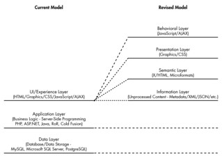
This model, which I call The Information Layer, has been the guiding force in my own work. It has helped me build some of the most successful sites in my career.
To others, it may have been just a theoretical model, but it was built from observations. The observations I had about front-end work and interaction design ideas concerning mobile and data. And it has proven invaluable as a guide in trying to predict how things would turn out in the last couple of years.
But the most important stage was reached this year when the first direct application was started – web application modeling or Project Ottawa. The project itself took The Information Layer and started the path that will eventually lead to a practical application.
However, there is a flaw.
For any model to work, you occasionally go back and test its parts to see what works and what doesn’t. That’s basically how Project Ottawa has been built and it is currently at its second draft (July 2012). But there was one thing that was bothering me – content. I had a better grasp of some of the other layers, but the lowest level of the model (Information Layer) was never really fleshed out. It was more of a “hand-waving” nod to content. There was really no fully defined description of this layer. In the end, it was treated just like the other layers in the model, out of consistency.
But it couldn’t. And those flaws where shown in August and September.
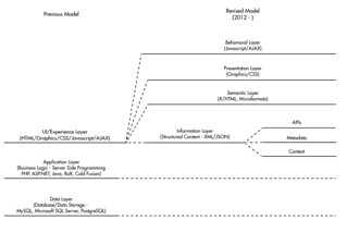
It started with a Karen McGrane lecture at the An Event Apart conference in August. She pointed out a model from the White House digital directive where they had a content model better than my own. After the initial shock, I decided that their model was better and made a revision to The Information Layer to be broken down into three parts – API, Metadata, and Content. In the end, this solves some of the weaknesses in the current Information Layer model.
The other part was some of the feedback from a presentation I gave at Mobile UXCamp DC 2012 in September of Project Ottawa. One of the most important criticisms was that there was little in terms of how changes in content could affect not only a single view/template but also the whole system/application. Likewise, what would happen in the reverse direction – if a change in an application affects content (i.e. responsive design).
So, after a hiatus of two months, I am back at work on Project Ottawa. But this same change meant that the focus on Ottawa will be on building the area that has been its weakness so far – content. With some thought during the hiatus, I have a possible solution that I will introduce next year (1/2/2013) called Content Mapping. At this point, I have only a few sketches (scans from Ottawa skectch/notebook) but I am creating a more refined demo.
But this also means the following:
- I am now starting to work on the Third Draft, for 2013 as planned and
- Project Ottawa will not longer be one model but a collection of integrated models along the blueprint analogy. Each model visualizes each aspect of a web application’s structure and interactions.
And so, the work begins again and Project Ottawa will be going on past its first anniversary in March.
Later.